UX/UI Design Trends Going Into 2024
Every year, we have a line up of new design trends that not only look good, but also stick around and influence other designers to “steal” the trend. Love it or hate it, there are actually some design waves that are smart and functional. These functions could range from including more information in less space, to build more engagement with the users.
Let’s have a look at some of these trends that are here to stay and are taking over the internet!
More Than a Child’s Lunch Box — Bento Boxes
Bento boxes are a staple in Japan’s culture of tiffins and lunch boxes. They are well known for storing food in a rather organised format and keeping things clean.

We’ll never know who thought about this, however bento boxes are as great digitally on a screen as they are filled with food in a bag.
Bento is another design trend that started making waves on platforms like Dribbble and Behance for millions of designers to pick up on, however the concept of “modular” design started with dashboards for websites. This includes sales and finance dashboards like PayPal, analytics like Google Ads, and a bunch more.
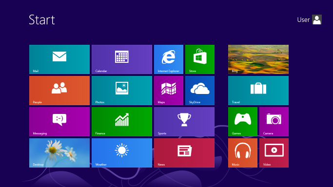
Remember Windows phone and Lumia? Well, the UI they used was essentially early iterations of Bento designs. Later, Microsoft also implemented this concept to their Windows desktop start menu with Windows 8.
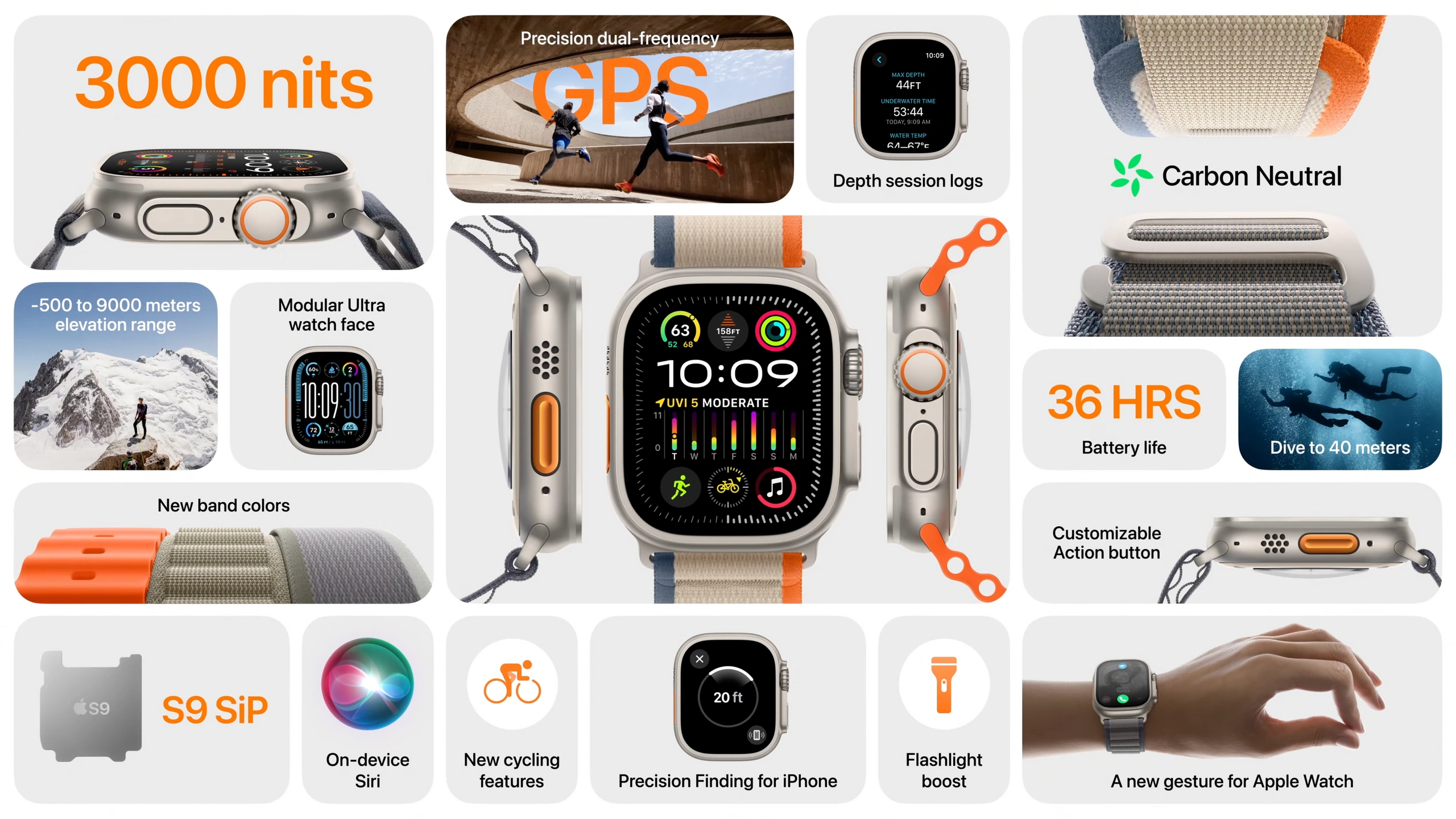
While being used by the industry all over, Bento designs blew up completely when Apple decided to first use a Bento grid. They initially used it on their iPhone landing pages, but soon expanded to Apple event slides and presentations.
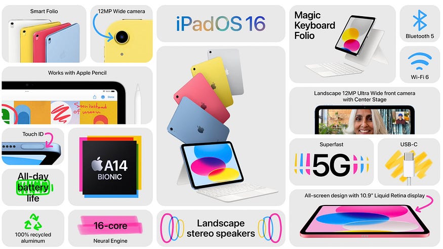
Apple is widely known to start megatrends, and Bento was just one of these. Every designer and their uncle was using Bento for presentations, websites, product launches, and the list goes on.
The biggest difference between older bento-like designs and the new trend, is that each section of the grid signifies a unique space instead of being a part of a group.
Unlike a lot of other UI design trends, Bento is actually evolving to be more than just a pretty layout style. It has now evolved to include product demos, mixed with some other unique layouts, and even stylised with new visual design concepts.
Have a look at this:
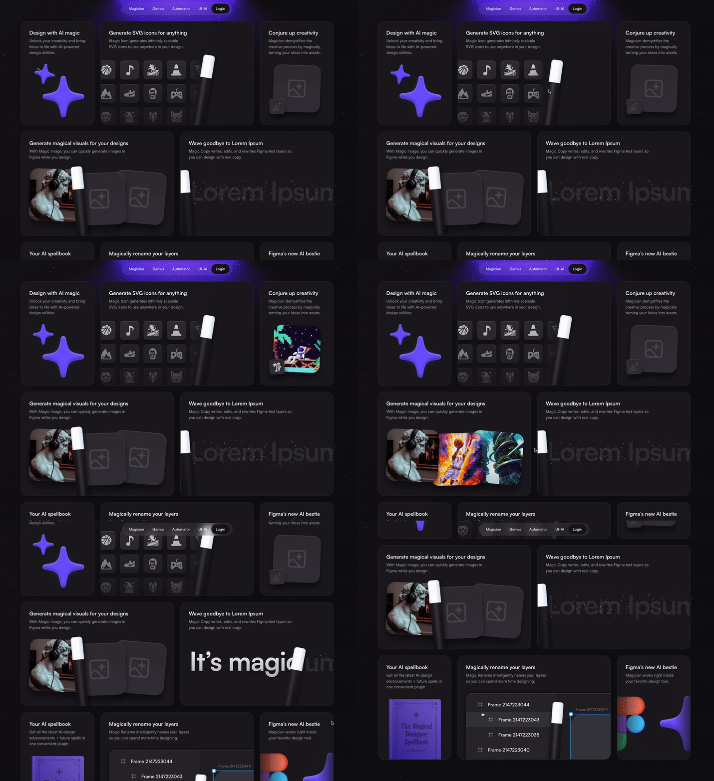
The above example is from diagram.com, which uses bento grids to show real life examples of what its tool can do through an interactive experience. This makes the tool so much more appealing and tells the users what they should expect.
To help designers like us, there are some websites dedicated to Bento design inspiration from all over the web. One such website is bentogrids.com, that has a large collection of just Bento grids for UI and graphic design. Bless the creators of this website!
Spatial Design Trends & Leaps in Technology
You’ve just woken up and picked up your phone to view “important emails” while going number two, and your entire feed is full of Apple’s new Vision Pro. This was the exact morning of every tech and design enthusiast in the world on June 5th of 2023.
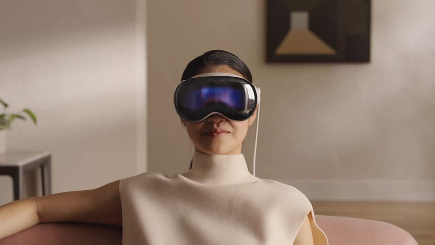
For the next few weeks, this was all the tech world could talk about, and every designer was trying to pick up spatial design skills. Apart from the design trend, various AR/VR startups came to the forefront and their tech was finally being spoken about. This gave a real boost to AR and VR, one that was truly needed.
With great tech, comes great design potential. From smartwatches to folding phones, designers have always come forward to show their true adaptability. Spatial design was no exception.
This comes with the launch of a popular designer focused tool called “Bezi”. It’s very close to design tools like Figma and Spline, but with the added 3rd dimension. Designers can get into spatial design, connect a working AR/VR headset, and create interactive spatial experiences.
A little glimpse of what Bezi allows us to create:
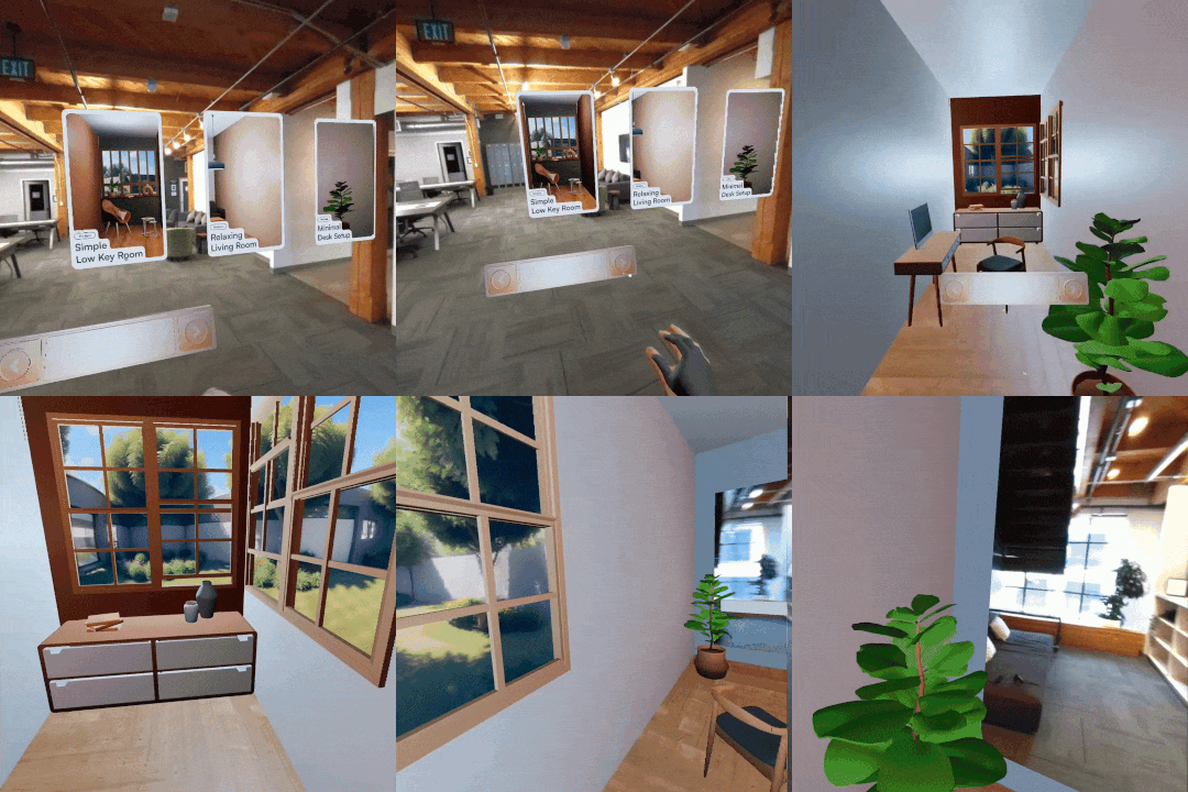
A large contributor to better AR/VR experiences, is better UX. Deeply understanding the tech behind the pretty designs, using an actual VR headset, testing things out in spatial environments, will all be part of the job. There will definitely be a lot of new lessons and changes to our current understanding of UX as we go along. However, this is one of those skills you want to stack up right now, and possibly use in the future.
Apart from the large imagination and deep pockets of Apple, there are some less tech-savvy companies which bring a whole new experience to wearing glasses.
Even though Google’s project “Google Glasses” never touched real big production, the sunglass company RayBan has entered the smart wearables race with their new Meta Wayfarer.
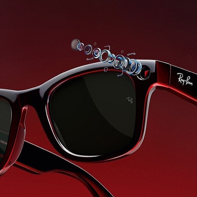
Don’t let the normal RayBan design fool you; The in-built cameras and smart features allow you to store video/images and livestream to social media. This brings a new dimension to user experience and customer experience. Perhaps, a trend for the year 2025. Who knows!
Everyone Can Animate!
A new trend is often born when a new skill becomes accessible to more people.
This was one mission that LottieFiles had. When I joined the company as an evangelist, I was already in awe of the easy animations we could add to any UI in any tool. Looking at the demand for lottie animations, they even launched a plugin for Figma that allows us to convert our Figma animations into an exportable lottie JSON file.
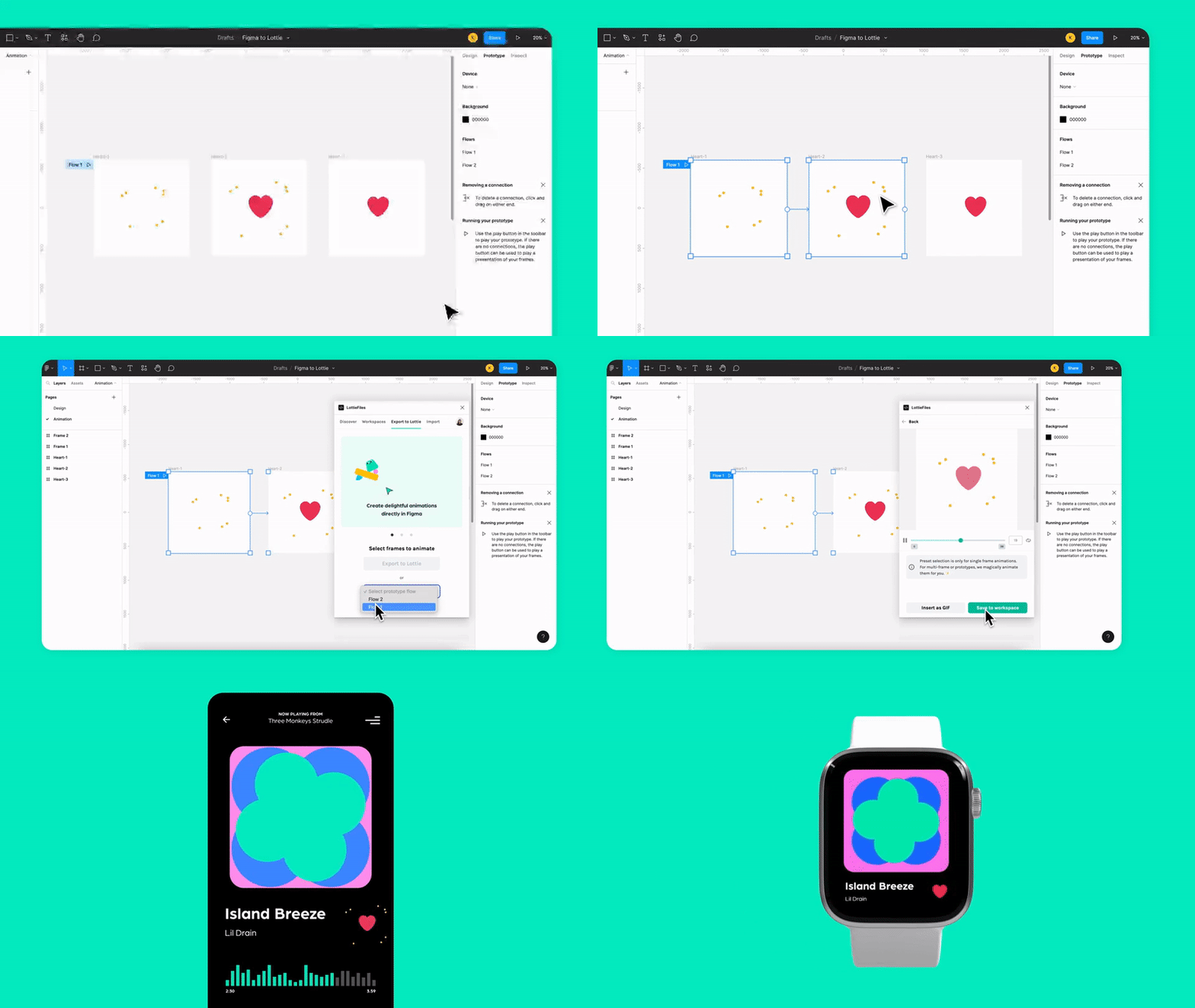
This eradicates the large learning curve of After Effects and similar softwares. Hence, more designers can animate quickly on their own.
You will also start to notice enticing interactions on every company’s landing page nowadays. This is all thanks to the ever-growing need for differentiating experiences for website visitors, and a greater demand for storytelling as a tool to sell products/services.
Take the following landing page interaction for example:
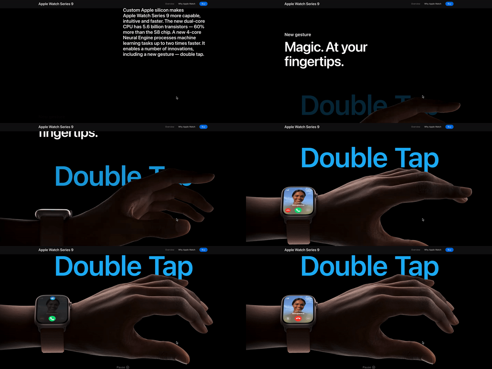
With scroll animations in place, visitors will be engrossed in what you have to present to them. No-code tools like Webflow and Framer are forever innovating to bring such animation capabilities to designers without the hassle of writing long lines of code.
One would think the ride ends here. Animation may have peaked and there is nothing more to look forward to. Fortunately for us, people in tech are always looking for the next big thing. Also, due to a never ending slew of capable tools, everything you can imagine becomes possible.
One such possibility has been the new “animated button trend”. A new UI style that brings in animation techniques to liven up a simple button. These changes range from a simple stroke animation around the button, to literal stars moving inside the button on mouse hover.
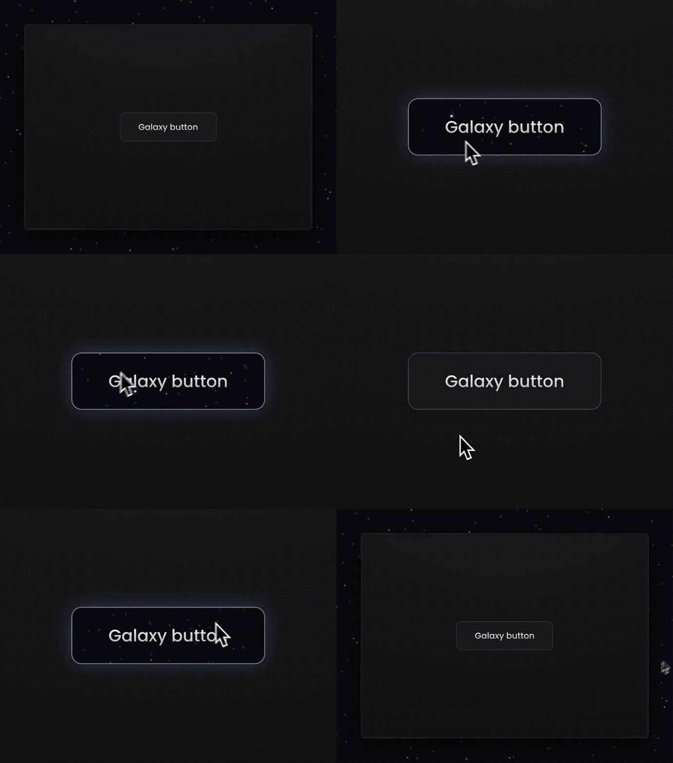
Such trends are often created by a domino effect. First one designer’s social post gets popularity, and then other prominent designers follow.
The End of Flat Design?
Of lately, a lot of designers are talking about how the design world is shifting from flat design (like the one you see here on Medium), to more pseudo realistic visual styles. These include 3D graphics, depth effects, neuemorphism, skeuomorphism, etc.
Recently, we saw a ton of companies implement 3D as a core style. Even though it might not show up right now on web and app design, logos are being updated with this new trend.
Much like the other design trends, a huge reason for people to implement these styles is an introduction of “easy-to-use” web based 3D tools like Spline and Vectary that make including 3D assets on web and app super easy. They also bring 3D assets to life using animations, with some of the shortest learning curves I’ve experienced.
It’s crazy to me as to how a basic linear gradient and some shadows, can add depth and a 3rd dimension to your designs and assets.
Another company that has always driven design and trends is Airbnb. They are widely renowned from their simple yet effective app designs and interactions. In 2023, they announced an app update that would really bring some new, important features.
What did they do? They incorporated more than a dozen 3Dish visual elements, and their announcement video is almost all about 3D.
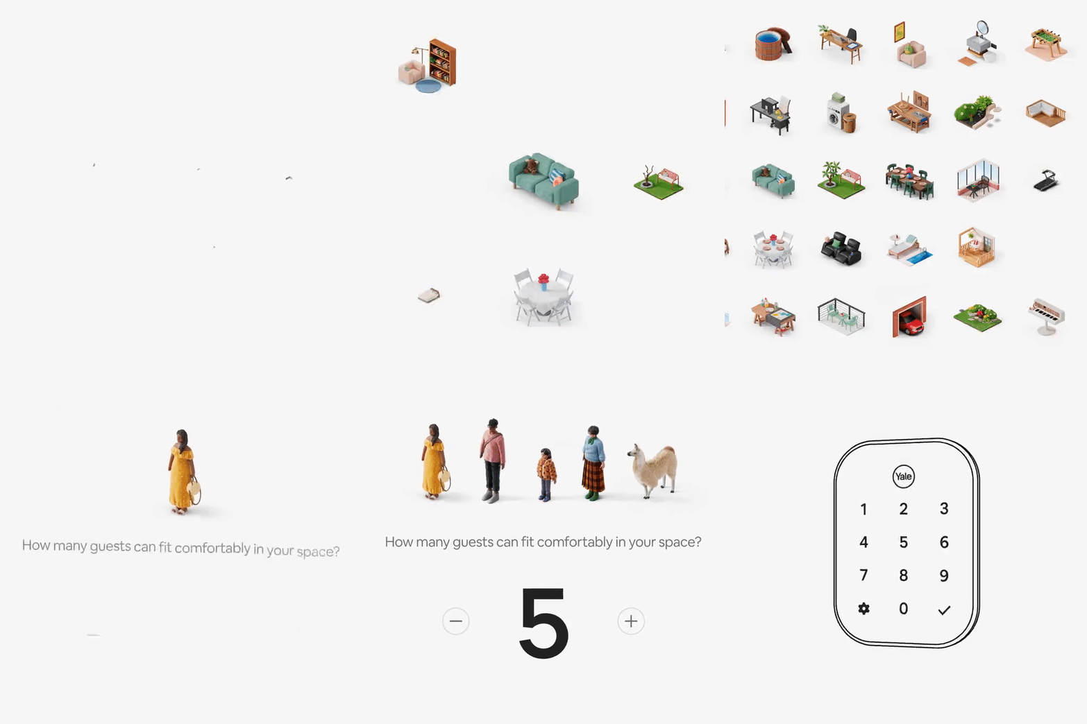
Isometric visuals, 3D characters and animations, and a slew of app interactions makes me want to watch on repeat. The transition from flat to 3D is truly slow and steady, which is why I believe this trend is here to stay.
Now, who started this trend is always going to be a mystery, but the demand for realistic and relatable designs, drives us to innovate for the user, and for our own selfish creative reasons of course.
The Flood of A.I. Design Tools — Friends or Foe?
Artificial intelligence is the most used and recognised word in tech in the past decade. While some designers take it as a threat to their career’s future, most of us are using this tech to create the best designs faster.
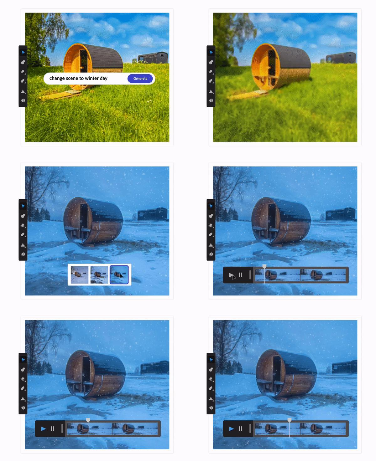
A set of design tools advertising themselves as “A.I. powered”, are trying to implement Open A.I. APIs at various levels, and are also working on their own A.I. model. However, most of these A.I. features are simply gimmicks. Randomly designing UI, shuffling assets around, and even providing basic solutions to tough problems. These are just a few of the criticisms I have, which are backed by a lot of community members.
In the clutter of these gimmicks, there are a few heroes that come to save the day. One such hero is Relume, a definite fan favorite. This Webflow focused company, launched something called Relume A.I., a powerful wire-framing and site-mapping tool.
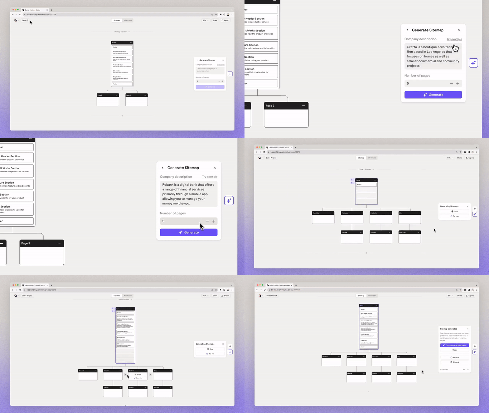
You put in a prompt, which is essentially your project description, and it spews out a complete and detailed site-map and a wire-frame as well. This wire-frame is full of relevant data and layouts that can be quickly copied over to Figma and Webflow.
Also, am I the only one who thinks Chat-GPT is ruining human creativity and building dependency?
More Careful & Empathetic UX
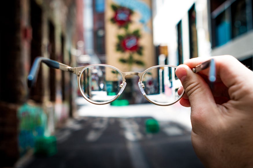
Enough about visuals and UI designs. UX has evolved to say the least, and this is something that can be justified by what UX researchers and designers are focusing on. This means leaning the process down to make designs accessible and inclusive.
A ton of designers are dipping their toes into the lake of usability over visual design. This has brought simpler and actionable designs to the centre. Designers are sticking to what works, rather than reinventing the wheel, despite the changes to the industry in the past few years.

The above Google trends graph shows how accessible design has become a truly industrial requirement.
These accessibility techniques range from color contrast, readable fonts, recognisable action elements, all the way to shadowing differently-abled humans to bring accessibility focused features to the board.
Why is Accessibility In Demand?
Accessibility is also being pushed hard due to the current need to design for people of all ages and even physical limitations. Companies want to cash in on all different demographics and are also pushing for inclusivity at every aspect. As more and more people go digital, it is almost mandatory for a designer to focus on accessible design.
Courses and bootcamps sniffed the demand from miles away and are also preparing students to get into design with a good knowledge of accessible design.
Personalisation
Apart from Accessibility, personalisation is what is really keeping people locked into an app or website. You must have seen this little message on YouTube before —
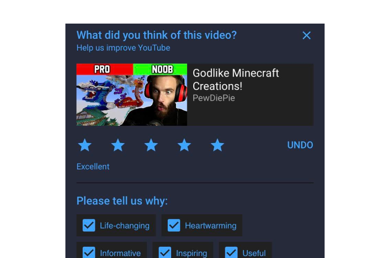
You might also observe various apps experimenting with a new feature for a few days, and then pulling it back because users didn’t appreciate it. This is a direct representation of how UX designers are taking the lead when it comes to the future of products and services.
If you liked the article,please follow our page
You’ve got this! All The Best.
Be a helping hand. Share it with someone who needs to see this! You can tag me on your Instagram to show some support! Thank you! ❤
some important links


